
The problem nobody mentions until the countertop is already installed
Granite is marketed as the “safe choice” for countertops—tough, timeless, and naturally beautiful. So why do so many buyers still end up with a project that feels off? Not cracked. Not broken. Just… disappointing. The colour looks different under kitchen lighting. The pattern feels too busy when multiple slabs are joined. The surface shows unexpected dull patches after a few months. Or the cutouts around sinks and cooktops look rougher than expected.
These are not rare accidents. They’re the predictable result of buying granite like a sample product instead of a finished installation. Granite is a natural material, which means variation is real. But if the selection rules and fabrication expectations aren’t locked early, natural variation turns into visual chaos—and the “premium” choice becomes a silent regret.
If you want a buyer-friendly starting point for how granite is typically framed for real kitchen use, begin with a curated hub like granite countertops and pay attention to how tone, movement, and application context are presented—not just colour names.
The “deadly details” that decide whether granite looks expensive or messy
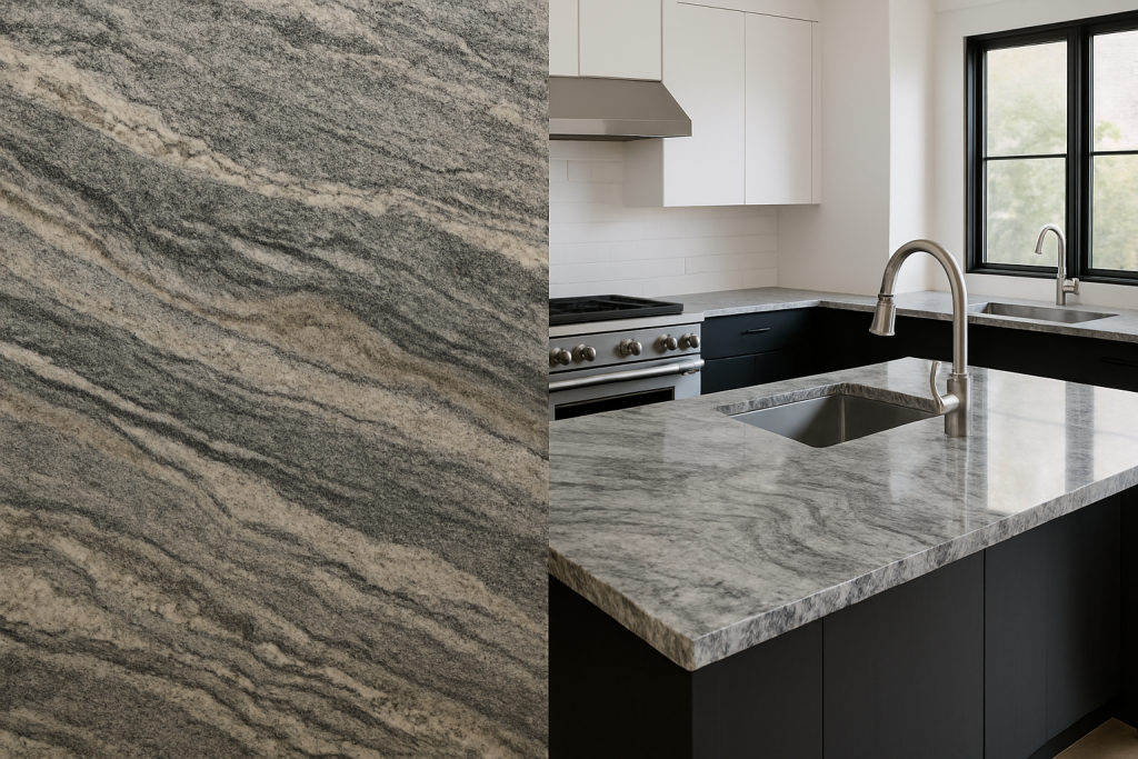
Most buyers judge granite by colour. Professionals judge it by behaviour. In real kitchens, granite must behave well across three realities: light, joins, and daily use.
Light is the first trap. A slab that looks calm in a warehouse can look speckled and high-contrast under cool white downlights. Dark granites can read luxurious in daylight but feel heavy at night if the kitchen uses warm LEDs. The second trap is joins. Granite is rarely installed as one uninterrupted piece; seams exist. If your slabs aren’t planned for how patterns align, your countertop can look like random panels rather than a designed surface.
The third trap is finish and maintenance. Polished granite hides some stains well but can show smears and reflections. Leathered and honed finishes feel modern and tactile but may reveal certain oils differently depending on the granite’s mineral composition. None of this is scary—unless nobody tells you before you order.
A practical way to shortlist without getting lost is to compare within a single, consistent material set—so you’re narrowing by tone and movement (calm vs dramatic) instead of guessing from one glam photo. That’s why buyers often start from a structured granite countertop selection rather than bouncing between unrelated stone pages.
A quick “use-test” that saves you from the wrong granite
Here’s a simple test professional buyers use: imagine the countertop installed, then ask what happens at the three stress points—sink, cooktop, and seam.
Around the sink, water, soap, and daily wiping will be constant. Busy patterns can hide water marks better, but they can also make the area look visually cluttered. Around the cooktop, heat isn’t usually the issue—granite handles heat well—but stains, oil splatter, and cleaning habits are. At seams, the question becomes: will the pattern make the join disappear, or will it draw attention to it?
If the granite passes this mental test, then you move to selection rules: define your tone window (how light or dark you will accept), define movement level (calm vs dramatic), and define matching logic (do you want the island to be the “hero slab” and perimeter calmer, or consistent everywhere). This is how granite becomes a design tool instead of a gamble.
For projects that need a bright, clean look without a “too busy” feel, many kitchens lean toward classics like Dallas White granite countertops because they tend to behave predictably under a wide range of cabinet colours and lighting temperatures.
The “most valuable” granite choices are usually the most predictable in projects
“Most valuable” doesn’t just mean rare. In countertops, valuable often means reliable: stable performance, proven popularity, strong visual impact, and easy pairing with cabinetry and flooring. Buyers who source for resale projects, hospitality, or multi-unit builds tend to prefer granites that behave consistently and don’t create surprises under different lighting conditions.
If you want to narrow your picks fast, study the selections that keep showing up in real countertop projects and why they work. This guide to the most valuable natural granite for countertops is useful for building a shortlist based on outcome and install logic rather than just stone names.
For buyers who want a deeper, more reflective “statement stone” without turning the whole kitchen heavy, options like Blue Pearl granite countertop can work well as a hero island surface—especially when the perimeter is kept calmer.
Case snapshot: same “premium granite,” two completely different kitchens
Kitchen A chooses a dark granite because it looks dramatic in the slab photo. The contractor installs it with a standard seam placement near the sink. Under the homeowner’s cool white downlights, the surface looks much more speckled than expected. The seam is obvious because the pattern doesn’t flow. The kitchen still works—but the countertop looks busy, not premium.
Kitchen B chooses a similar colour family but uses controlled selection rules: one slab family for the island, calmer movement for the perimeter, seam placement planned to avoid high-visibility zones, and finish chosen based on how the household actually cooks and cleans. The result feels intentional. The granite looks quieter and more architectural, without relying on gimmicks.
What to request when buying granite for countertops (so you sound professional, not picky)
You don’t need to demand impossible uniformity. Granite is natural. What you need is clarity.
Ask for a defined shade range across your order. Ask how slabs will be grouped if you’re doing multiple countertops or a large island plus perimeter. Ask what finish is recommended for your cooking habits and lighting. Ask how cutouts are finished and inspected, especially around sinks and cooktops. Ask how seams will be planned—and whether the supplier can advise on pattern flow.
Most importantly, communicate your intent in one sentence: “calm modern,” “dramatic luxury,” or “classic neutral.” Granite selection gets easier the moment intent is clear.
And if your project extends beyond countertops—say, you want granite as a matching furniture surface in a dining room or hospitality space—it helps to see how the material is used across formats like a granite dining room table, because edge finishing and surface reflection behave differently at table height than on a kitchen run.
Closing thought: granite isn’t risky—unclear buying rules are
Granite earns its reputation for durability, but the real reason it succeeds in kitchens is that it can look both natural and refined when chosen correctly. Treat it like a finished installation rather than a slab photo, and you avoid the common traps: lighting surprises, messy seams, and finish regret.