
White kitchens have been a design standard for long enough that the question is no longer whether they’re popular — obviously they are — but whether you can execute one that feels intentional rather than defaulted to. There’s a version of the white kitchen that’s crisp, layered, and quietly sophisticated. There’s another version that’s flat, cold, and indistinguishable from every other white kitchen that came before it.
The difference between them isn’t budget, and it isn’t square footage. It’s the degree to which the design treats white as a palette to be composed rather than a single color to be applied. A white on white kitchen works when it’s built from multiple whites with different undertones, different sheens, and different textures that create depth and visual interest without introducing contrast that would undermine the monochromatic effect.
Understand That White Is Not a Single Color
The first thing anyone designing a white kitchen needs to understand is that white is a family of colors with significant internal variation. Warm whites lean toward yellow, cream, or pink undertones. Cool whites lean toward blue, gray, or green. True whites sit at neither end of that spectrum but still have character that reveals itself in different lighting conditions.
Combining whites that pull in opposite directions — a warm-undertone cabinet paint with a cool-undertone countertop quartz — creates a visual dissonance that’s difficult to name but immediately felt. The kitchen looks slightly off without the viewer being able to identify why.
Designing a cohesive white kitchen requires selecting whites that share undertone direction. All warm, all cool, or all true — but consistent. This doesn’t mean identical. It means that when you hold the samples together in the natural and artificial light conditions of the actual space, they read as belonging to the same family rather than competing.
Use Texture to Do the Work That Color Can’t
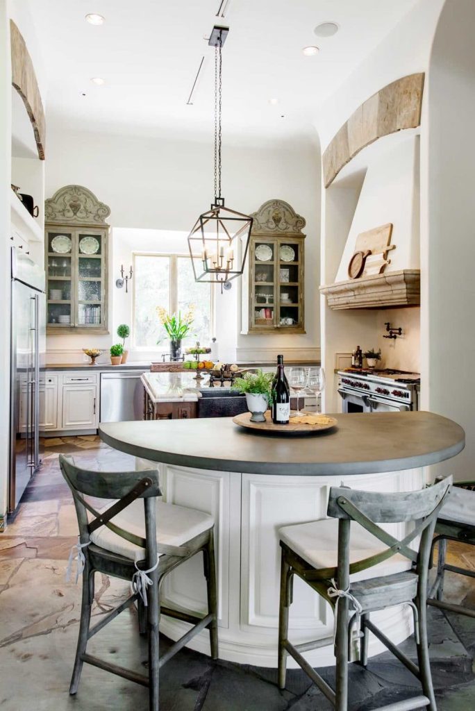
In a monochromatic palette, texture becomes the primary source of visual interest. This is where white kitchens that look sophisticated diverge from ones that look sterile: the sophisticated ones are built from materials with different surface qualities that create movement and dimension under light.
Matte cabinet paint next to polished quartz countertops. A handmade ceramic subway tile with slight dimensional variation next to flat-painted uppers. An unlacquered brass hardware finish that develops a patina over time, sitting against a shaker cabinet door with a paint sheen that reads slightly differently in morning light than in evening light.
None of these contrasts involves introducing a new color into the palette. They all work within white while creating the layered quality that makes a kitchen feel designed rather than decorated.
Vary the Sheen Levels Deliberately
Sheen management is one of the most underutilized tools in white kitchen design. The same white paint in a flat finish and in a semi-gloss reads as visually distinct under the same lighting conditions. Applied strategically — flat or eggshell on large cabinet surfaces, semi-gloss on trim and detail elements, high-gloss on a specific accent element — sheen variation creates structure in the palette without requiring color.
This technique also has practical advantages. Higher sheen surfaces are more washable and more durable in a cooking environment. Directing higher sheen to the surfaces that see the most contact — cabinet door fronts, drawer faces — while using a softer sheen on upper cabinets that are touched less frequently makes maintenance sense as well as design sense.
Let the Hardware Anchor the Space
In a white kitchen, hardware selection carries more visual weight than it would in a kitchen with more color. When the palette is monochromatic, the hardware is often the clearest point of visual focus — the element that the eye travels to when surveying the space.
This is an opportunity, not a constraint. Unlacquered brass pulls against white cabinets create a warm, organic contrast that reads as handsome rather than stark. Matte black hardware in the same context creates a sharper, more contemporary contrast. Brushed nickel or chrome in a cool-white kitchen reinforces the cool, clean quality of the palette.
The key is consistency — choosing a hardware finish and committing to it across all cabinet and drawer pulls, with the same finish carried through to faucet, lighting fixtures, and accessories where possible. Hardware that’s consistent across a space creates a visual thread that makes the design feel resolved.
Address Warmth Intentionally
The risk in a white kitchen is coldness — not in terms of temperature, but in terms of the sensory experience of the space. All-white environments can feel clinical rather than inviting, particularly in homes where the kitchen is a gathering space rather than purely a cooking space.
Warmth in a white kitchen comes from material choices and from the human elements of the space. A wooden cutting board on the counter. Open shelving in white oak rather than painted wood. Linen window treatments that soften the hard lines of cabinetry and countertops. A pendant light in a natural material — rattan, hand-thrown ceramic, aged brass — above an island.
These aren’t departures from the white palette — they’re grounding elements that give the white surfaces something warm to sit against. The goal isn’t to add color for its own sake but to ensure that the finished kitchen feels livable and human rather than showroom-perfect.